Shop signs and shutter paintings found around Birmingham. This old handpainted one...I love where the paint is fading.
I would like to study arabic typography in detail at some point, I love the square-ness of the two forms on the top of this sign.
This looks almost as if it were painted then taken apart and put back together slightly wrong...perhaps something to convert into a technique at some point.
Presumably accidental but AMAZING!
I love drippy type, I made this animation last year with chocolate:
There's a nice post from Eye Magazine here. on greek shop signs in Athens. I love type/letterforms that become distressed and worn over time, ever changing.
Really liked the type combination in these titles/credits, seemed to suit the film (which on a visual level was such a celebration of italian style..without being too ostentatious) perfectly.
Letterforms from found objects... Swedish studio Hjarta Smarta created three different weights using earings, lots of really nice typo work on their website.
Went on a phototrip to Weston-Super-Mare over the weekend, these are whole words rather than letters, but I like them none the less. More photos from Weston on my Flickr.
Watched Yellow Submarine for the first time in a long long while the other night...this was pretty much my favorite film when I was a kid. It dawned on me half way through that it might have at least been party responsible for the love of illustrative typography that I have now, as it's full of beautiful hand drawn type. The number sequence that comes in at about 1:30 in this clip (also pictured below) is particularly brilliant:
The 1968 film was directed by animation producer George Dunning,working closely with illustrator Heinz Edelmann who was responsible for the amazing character designs. There's an interesting obituary to Edelmann here.
First hunt for some letters/letterforms for the typography project, I found more numbers...I like the 84s a lot...all found on a canal walk from the Jewellery Quarter to Spaghetti Junction.
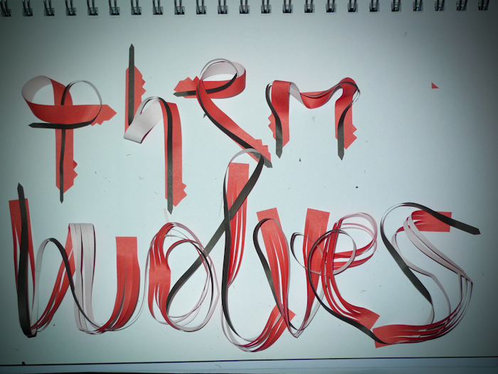
Earlier this year I read a piece about the french typographer Roger Excoffon and it mentioned how he used to use paper strips to create typefaces. It inspired me to have a go and I made the alphabet and "Mobius" below.... Fast forward a few months and I thought about taking some serifs inspired by some of the type on display at the Home of Metal show, and using them in my current wolf-based work. I'll probably continue experimenting with this process and finding other ways to distort the paper strips.
Checked the Ed Rucha show at Wolves Art Gallery the other week. Really loved this piece, it makes me feel sad. I really want to start making typography that is more expressive like this, in the way that it emphasizes and adds further meaning to the words, not just pretty letters.